[ Responsibilities ]
Content
Other similar projects
2024-2025
[ Branding, Website Design, visual design ]

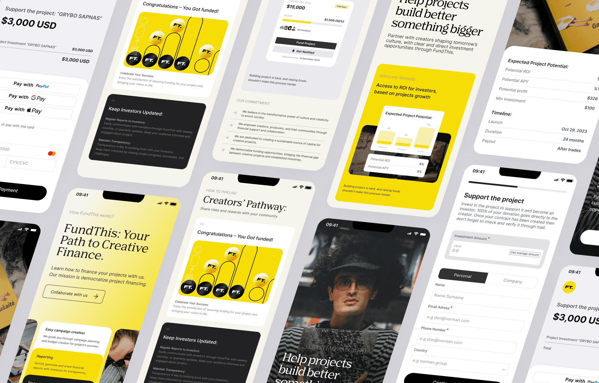
Fund This
Overview

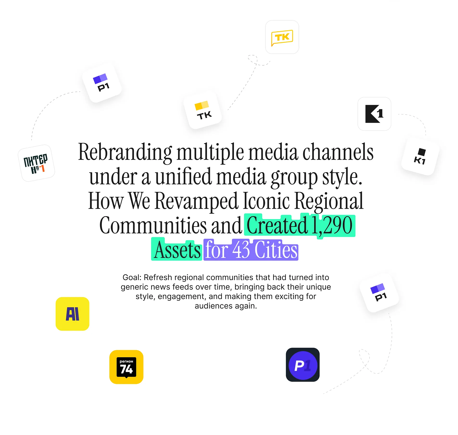
5 Public Media Group
Scope of work
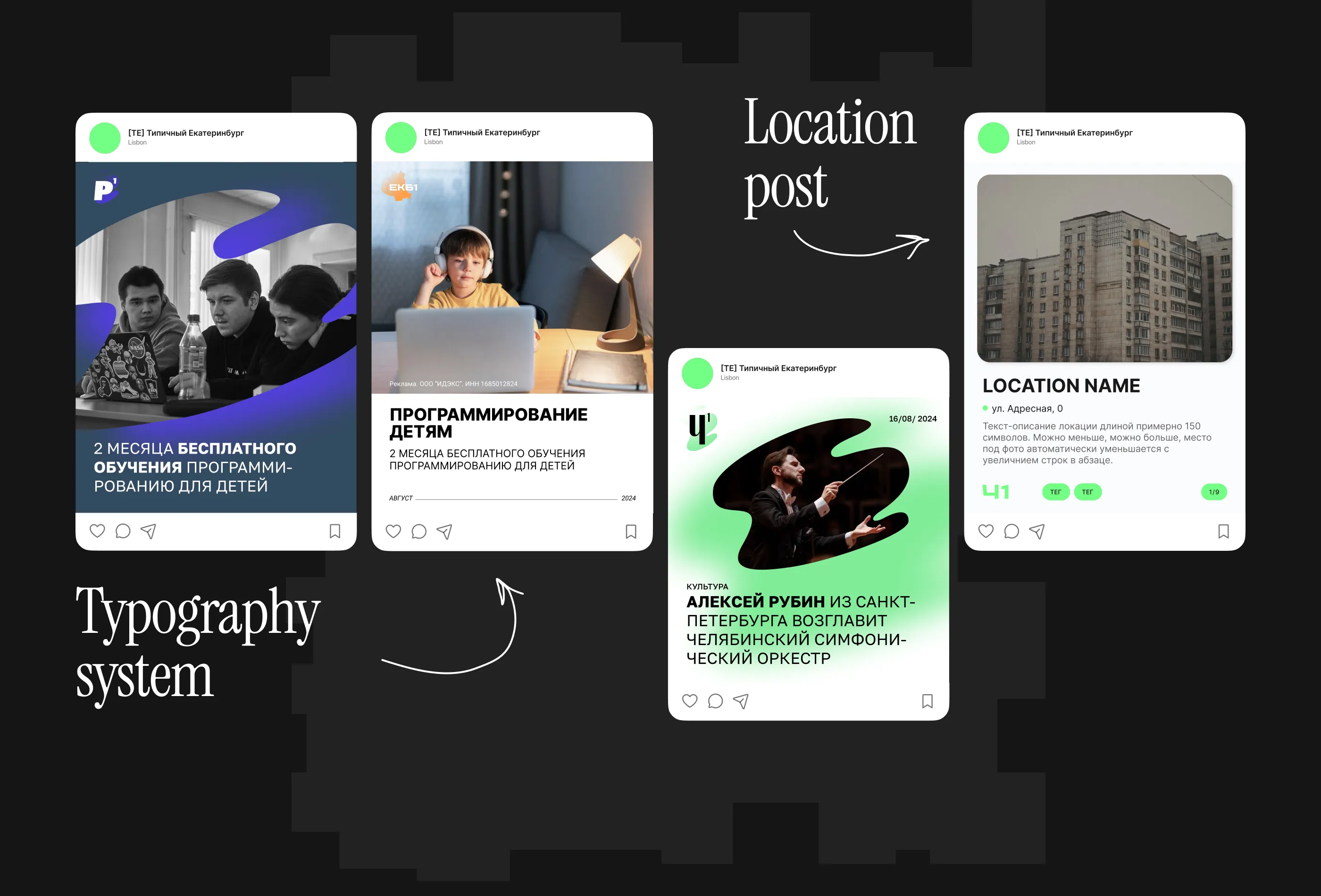
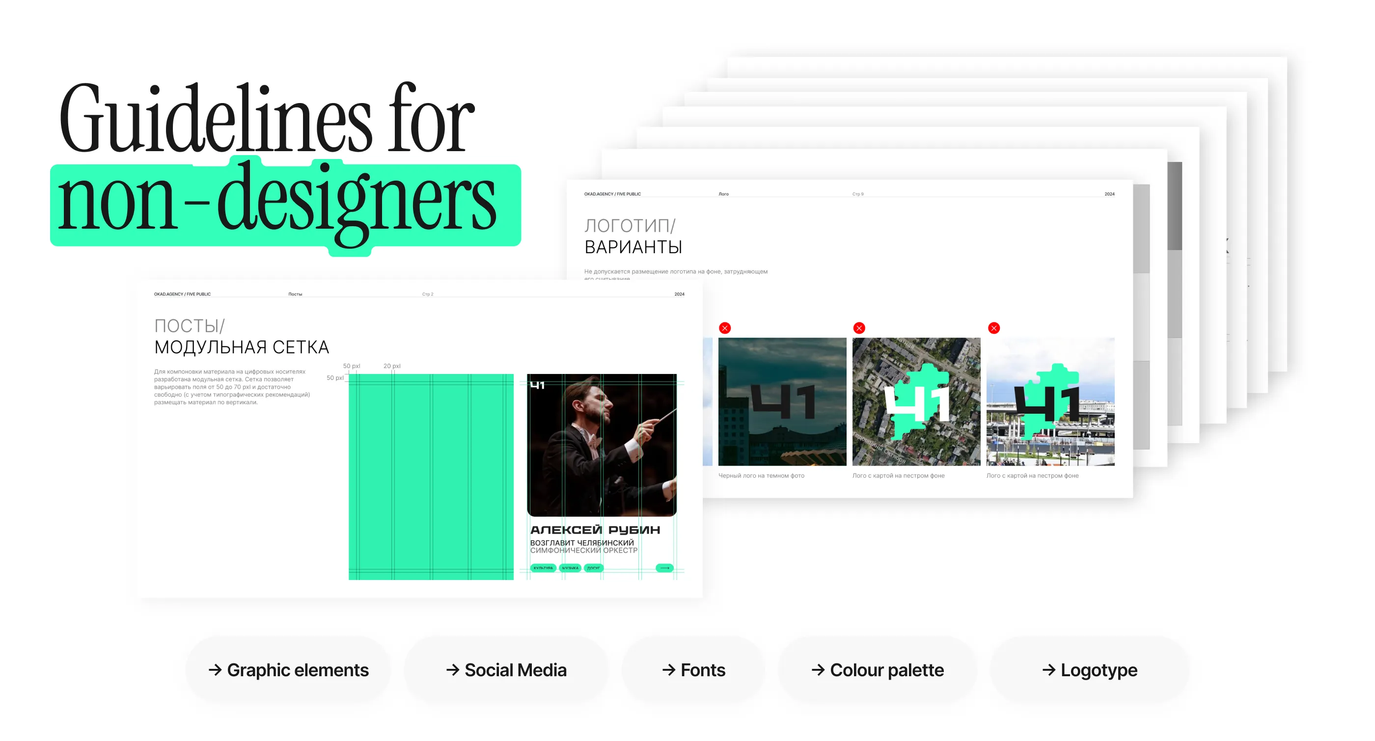
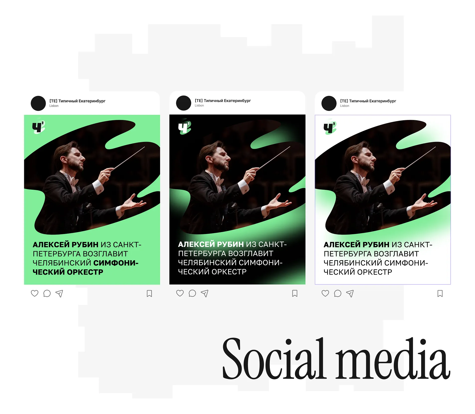
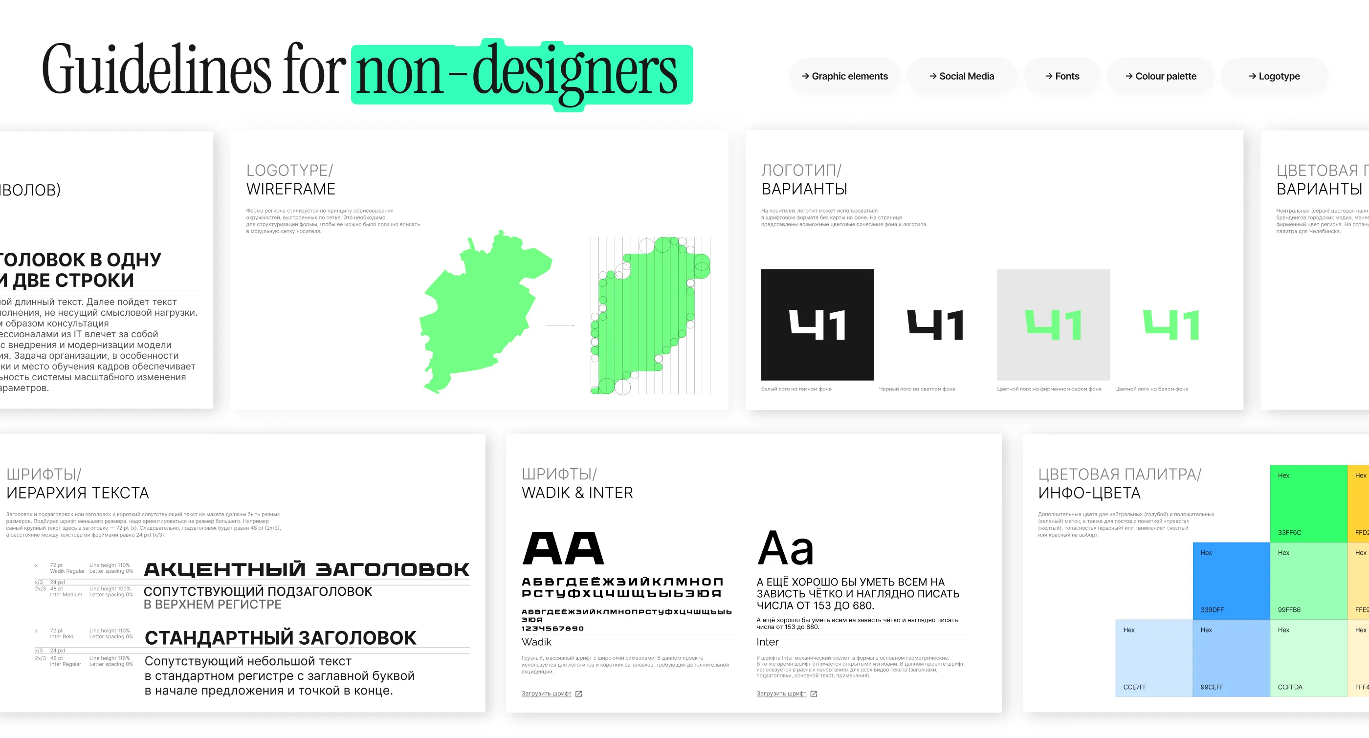
Social Media Templates Assets
Branding Assets (1290 elements)
Regional Media Brandbook Guidelines
Competitor analysis
The parent company of brands
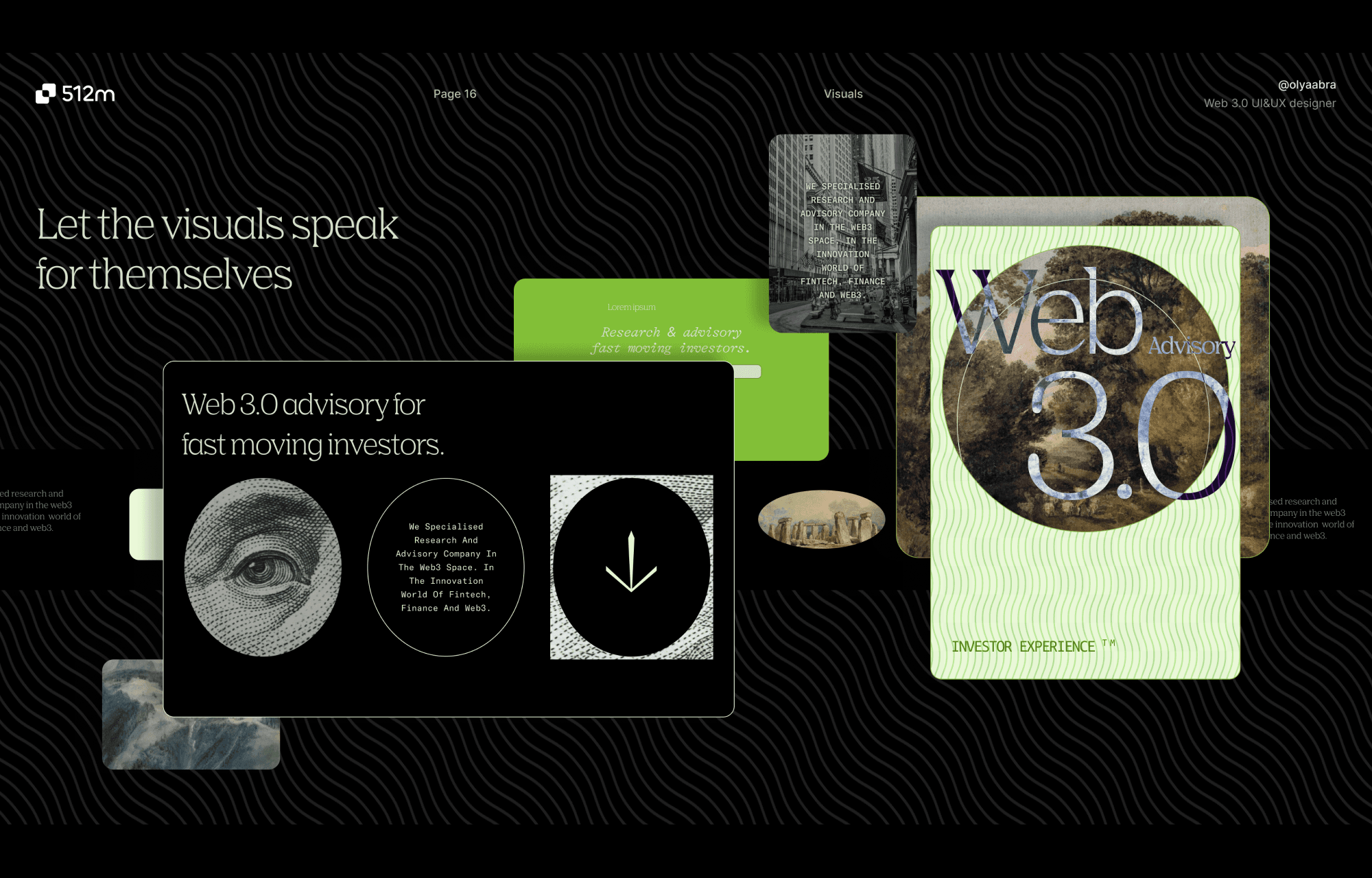
Visual Design


[ 5Public Goals ]
Create a unified visual identity across all regional communities
The challenge was to develop a consistent brand style for a diverse media network — 13 VK communities and 28 Telegram channels — while preserving each region’s unique identity.
Roll out new branding within a tight strategic timeline
5Public was entering a rebranding phase with pre-approved concepts. My task was to implement the full visual identity — logo, typography, color palette — and scale it across all key assets.
The timeline was critical due to internal deadlines, so the challenge was to deliver fast without compromising quality or consistency.
To make the brand instantly recognizable across platforms through one cohesive visual system with consistent visual identity
We've created brand guidelines, defining its look and feel across platforms. This ensured visual consistency and streamlined collaboration across design, development, and marketing.
Save authentic elements from initial brand version
Each region retained its own name and brand color (e.g. Nizhny Novgorod – blue, Yekaterinburg – purple), so the new visual solution had to be flexible enough to integrate with existing identities while reinforcing overall brand recognition.
Create either a shared supporting element and a full design system. That ties all regional communities together under one cohesive brand direction — without losing their local character.


01
Regions' Map Outline
A stylized regional map in an accent color anchors the design with soft lines and a friendly feel.
02
Typography
The bold, angular typeface contrasts with the soft map, reflecting the city's resilience, journalistic edge, and approachable tone.
03
Framed Map
Created clear and visually structured updates to keep the client informed at every stage of the process, which helped build trust, streamline feedback, and justify requests for additional resources when needed.


As an Art-director, I led visual direction and worked closely with agemcy's team and client to bring the visual vision to the brand guidelince in real life.
My role combined strategic thinking and execution — from shaping the core ideas and thoughts to crafting strong visual narratives that supported product growth and market presence.
I contributed to product strategy by designing user flows, identifying key features, and guiding how they should evolve. My role bridged product thinking and execution — from fast screen delivery to building visual narratives that supported growth and market expansion.
Conducted a detailed audit of each community, analyzing its audience, content, and engagement
Researched trends in regional digital media to identify relevant formats
Defined and maintained the visual identity of the brand
Developed 15 concepts for each of the 43 cities, resulting in 1290 unique assets
Created a new visual identity, refreshed branding, and standardized content formats
Developed and implemented a scalable design system and Brand kit for all the current and future media for cities
Presented all the iterations and final concepts to the client
Designed the team flow and prioritized tasks and timelines to align with business goals
Created some of the visuals and storytelling around the
Communities received a modernized visual identity while maintaining recognition
Content became more structured and adapted to today’s digital media landscape
Audience engagement started to grow again, turning these communities back into interactive spaces rather than just news feeds


results for the OKAD agency
Delivering Client Satisfaction and Reputation Growth
The agency brought me in for my problem-solving skills and ability to manage high-stress or conflicting situations.
High-Impact Contribution Beyond Visual Design. My soft skills in client communication were key, and my technical understanding of process planning helped shift the focus toward a high-level strategic approach — beyond just visuals. This not only strengthened the agency's positioning but also built trust with the client.
Although it wasn’t a high-margin project, it brought strong reputational value and resulted in a satisfied client.
1. Building Alignment Across Fragmented Brands
5Public’s ecosystem included 40+ communities with different names, tones, and visual styles. Bringing them into a unified system without losing local identity required deep listening and strategic framing.
I learned how to lead conversations that balanced standardization with flexibility — turning visual alignment into a shared goal, not a top-down directive.
I used modular visual systems and reference-based storytelling to show how consistency could empower, not erase, regional uniqueness.
The project came with tight internal deadlines tied to broader company restructuring. There was no space for creative drift.
To keep things moving, I implemented visual structure early — not just in assets, but in process: week-by-week focus plans, visual check-ins, and layered feedback loops.
It reinforced how strong design leadership is often about clarity, not just vision — and how deadlines become easier to meet when the path is visibly mapped.
I collaborated with junior designers on a massive asset rollout (1,200+ visuals). With varied content and regions, the risk of inconsistency was high.
I built a design system that was not only scalable, but easy to onboard into — from color rules to naming structures to review checklists.
Teaching through execution sharpened my ability to lead, while leaving behind tools the team could keep using beyond my involvement.
At first, branding was seen as a surface update — but I helped reframe it as a strategic asset to re-engage audiences and reposition the network.
Through before/after scenarios, future use cases, and data-backed design logic, I helped shift client perception from “make it pretty” to “make it meaningful.”
This project reinforced how visual thinking can support not just marketing, but organizational change.
The biggest challenge: keeping regional identity alive while introducing a single brand language.
The solution wasn’t to flatten differences, but to find shared visual ground — flexible elements that could adapt to local color palettes and naming quirks while staying unmistakably part of one brand.
It taught me how to design systems that respect context — and how consistency isn’t about sameness, but about recognizability at every touchpoint.